LinkedIn Banner Size and Design Guide
Designing a LinkedIn banner is easier when you understand the correct dimensions, safe area, and layout rules. This guide walks through the essentials so your banner looks professional on both desktop and mobile.
A LinkedIn banner can look impressive in a design file but still fail on the profile itself if the sizing is wrong. That usually happens because people design for the full image area without thinking about LinkedIn’s layout. The profile photo covers part of the banner. Mobile views can crop differently from desktop. Text that looks balanced in one preview may disappear or feel cramped in another. That is why understanding size and layout rules is just as important as the design style itself.
In this guide, we will cover the recommended LinkedIn banner size, safe area advice, text placement, image quality, and design decisions that help you create a clean and professional result. If you are building a banner for personal branding, job searching, consulting, or a company page, these principles will help you avoid common mistakes.
What Is the Recommended LinkedIn Banner Size?
For personal LinkedIn profiles, the commonly recommended banner size is 1584 x 396 pixels. This wide format gives you a 4:1 ratio, which suits the horizontal cover area at the top of the profile. Starting with the correct size helps prevent stretching, awkward cropping, and blurry images.
When you create your design in the correct dimensions from the beginning, you have more control over alignment and spacing. Even if LinkedIn compresses the file slightly, a properly sized image will usually display much better than an image that was made in the wrong proportions and resized later.
Understand the Safe Area
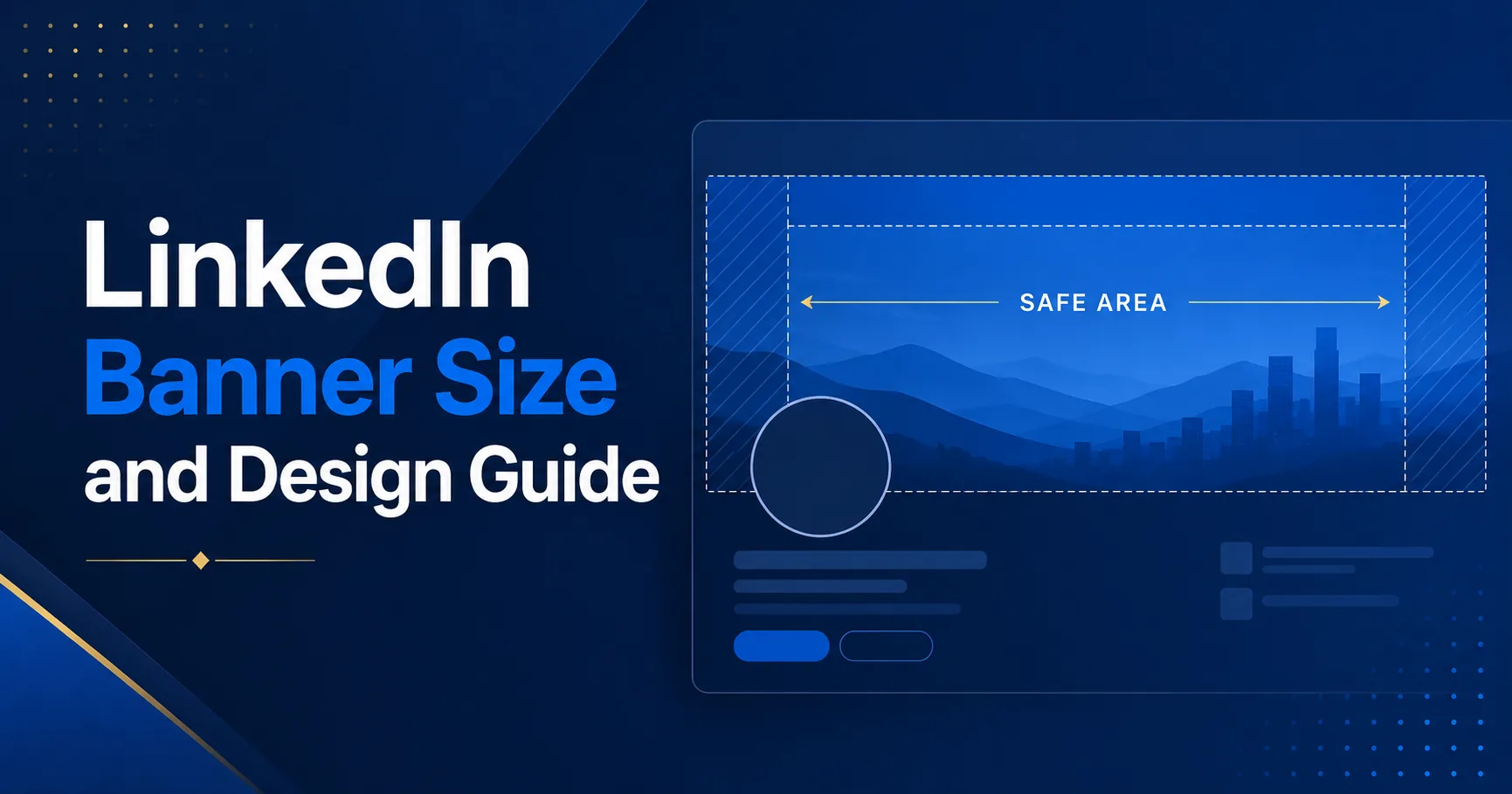
One of the biggest layout issues on LinkedIn is the profile photo overlay. On desktop, the profile image appears over the left side of the banner. That means important information placed too close to the left edge can be partially hidden. The safest approach is to keep your key message, logo, and major visual elements toward the center and right side of the banner.
A good rule is to think in layers. The full image area is your canvas, but only part of it is fully reliable for text. Your safest message zone is often the middle-right section of the banner, where it will remain clearer on both desktop and mobile. Decorative elements can extend further, but your main message should stay in the safe area.
Use High-Quality Images
Low-resolution graphics can make even a well-designed banner look weak. If you use a photo background, make sure it is sharp and large enough for the full banner dimensions. If you use icons or illustrations, export them clearly. Avoid screenshots or graphics taken from small social media previews because they often look soft once stretched across the banner area.
File clarity matters because LinkedIn profiles are associated with professionalism. A blurry banner suggests poor attention to detail. If you are trying to build authority, trust, or credibility, clarity matters just as much as composition.
Keep the Design Simple
Because the banner space is wide and short, it works best with simple composition. You do not have room for long paragraphs or multiple competing messages. Focus on one primary idea. That might be your profession, your service promise, your company positioning, or your career direction.
For example, a consultant may use a short phrase such as helping SaaS teams improve conversion. A job seeker might mention their field or focus area. A founder may choose a concise brand statement. The key is brevity. Visitors should be able to understand the banner in a second or two.
Need design help?
Our LinkedIn banner design services can help if you want a professionally planned layout without guessing about safe areas and composition.
Choose Typography That Is Readable
Readable typography is essential. Thin fonts, tiny text, or low-contrast text often fail inside a LinkedIn banner. Use a clear sans-serif typeface and make your most important text large enough to be scanned quickly. Also make sure the text color stands out against the background. White on dark blue often works well. Dark text on a light background can also work if the layout is clean.
It is also wise to limit the number of font styles. One bold style for the headline and one supporting style for smaller text is often enough. Too many font treatments make the banner feel less professional.
Use Colors That Match Your Brand
Your banner should feel connected to the rest of your professional presence. If you already have website colors, brand tones, or a consistent visual identity, carry them into the banner. This creates continuity between your LinkedIn presence and your other channels.
If you do not have a defined brand yet, choose colors that reflect the tone you want. Blue is often associated with professionalism and trust. Green can feel calm or growth-oriented. Black and white can feel minimal and sharp. Accent colors should be used carefully so the design does not become visually busy.
Design for Desktop and Mobile
Many users check LinkedIn on both desktop and mobile. While the full design may still appear, the user experience can vary. Important content that looks perfectly placed on a desktop may feel too close to the edge or less balanced on a phone. That is why testing matters.
When possible, preview your banner on different screens. Keep the most important information near the center-right. Avoid relying on tiny supporting details because those may not read well on smaller displays.
What Should You Include in a LinkedIn Banner?
The answer depends on your goal. A personal brand banner may include your profession, niche, or signature promise. A company page banner may include a brand message, core service, or value proposition. A job seeker banner may highlight their career focus. In all cases, less is usually better.
- A clear visual theme that matches your profession or brand
- A short and relevant message
- Professional colors and typography
- Good spacing and easy readability
- Placement that respects the safe area
Common Mistakes to Avoid
The most common mistake is overcrowding the banner. Too much text, too many icons, or several conflicting ideas make the banner less effective. Another mistake is placing text in the far left area where the profile photo covers it. A third issue is using weak image quality or a generic stock design that does not really say anything about the person or brand.
A well-sized banner works best when it supports a focused message. If your goal is simply to make your profile look polished, clarity still matters. A clean design with a subtle visual identity is more powerful than a noisy one.
If you are still deciding what your banner should actually communicate, start with our article Why Your LinkedIn Background Banner Matters. If you are building a banner specifically for your job search, also read How Job Seekers Can Use LinkedIn Banners to Stand Out.
Final Thoughts
Designing a LinkedIn banner is much easier when you begin with the right size and a clear plan. Use the recommended 1584 x 396 dimensions, protect your message inside a safe area, keep the design simple, and make sure the image looks sharp. Those small decisions will help your banner look more professional and more effective.
Your banner does not need to be complex. It simply needs to fit the platform, support your brand, and communicate the right message at a glance.
Want a professionally designed banner without dealing with the layout yourself? Get in touch with us and we can design a LinkedIn banner that fits your profile and goals.